Custom Standoff Signage for the Georgian Bay Native Women’s Association

The call started simple: a wooden sign for the front desk. Something warm, natural, and welcoming for the Georgian Bay Native Women’s Association office. But the more we talked about it, the more we kept thinking — what if the letters floated off the wall?
Standoff signage creates a gap between each letter and the surface behind it. When light hits it right, you get this dramatic drop shadow that makes the words feel alive. It’s a completely different presence than flat lettering, and for words that carry real meaning, that felt important.
What started as one sign became three — all in Anishinaabemowin (Ojibwe), placed throughout the space to greet people in the language of the community the association serves.
Three Signs, Three Greetings
Each sign was placed in a different area of the office, and each one carries its own meaning in Anishinaabemowin:
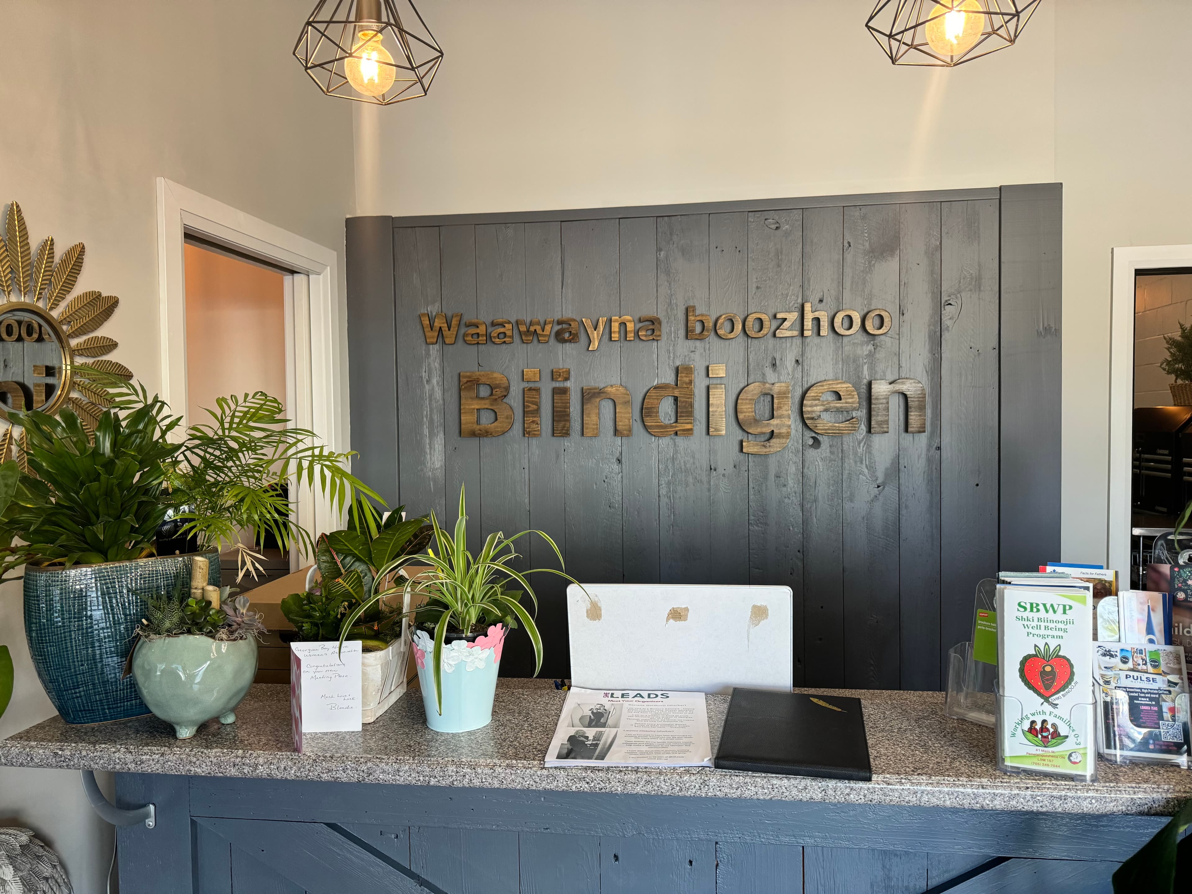
Waawayna boozhoo Biindigen — “Welcome, hello, come in” — behind the front reception desk, the first thing you see when you walk in.
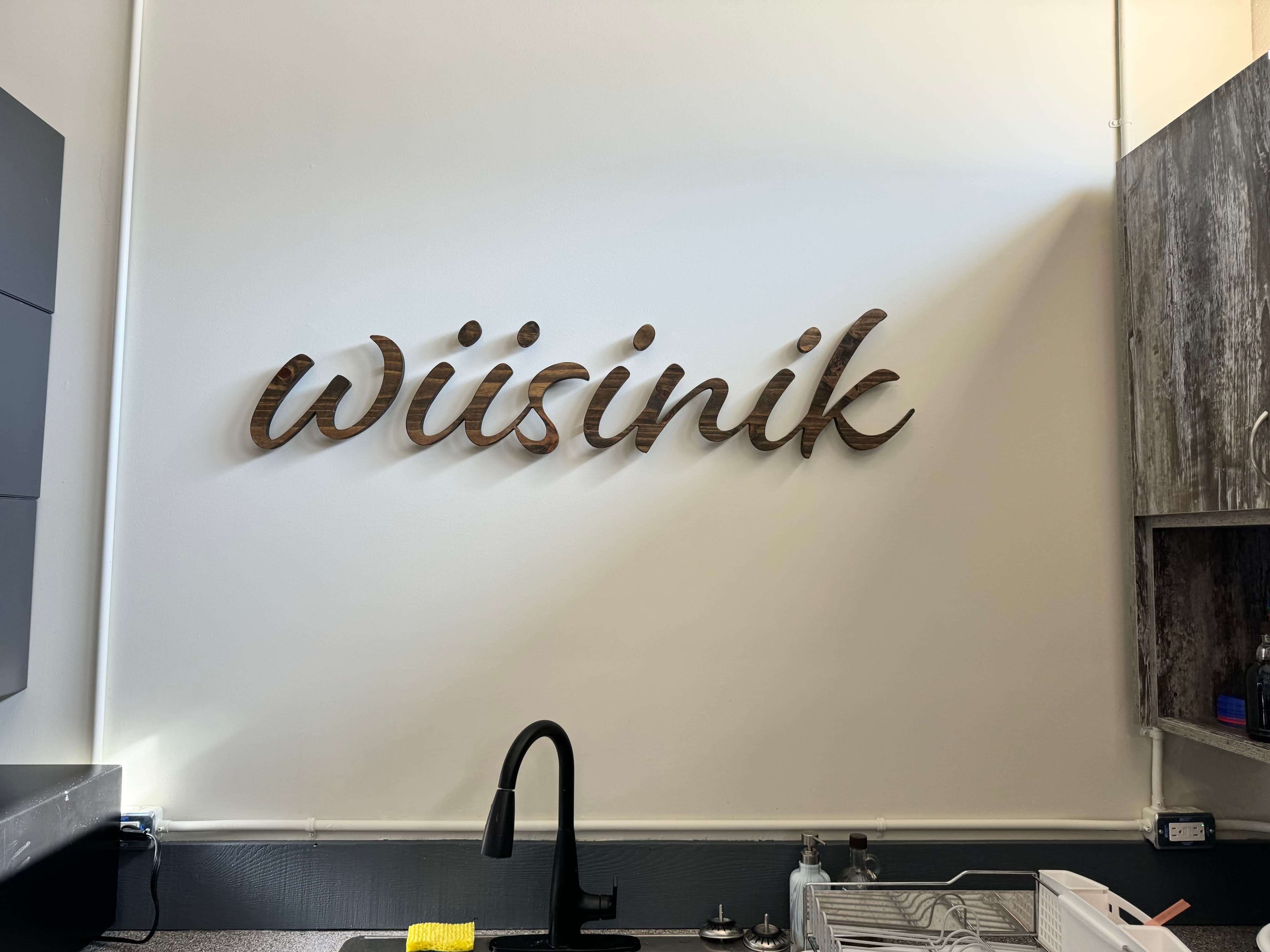
Wiisinik — “Eat” — above the kitchen sink. Simple, direct, exactly where it belongs.
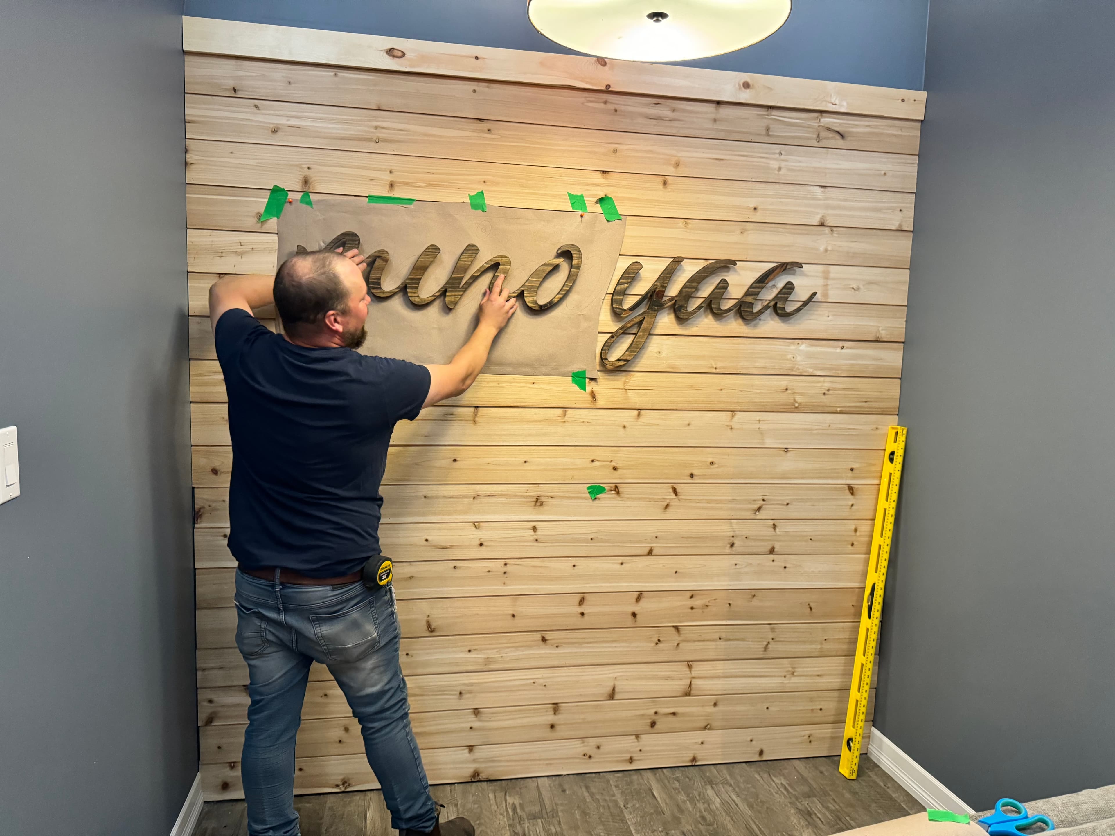
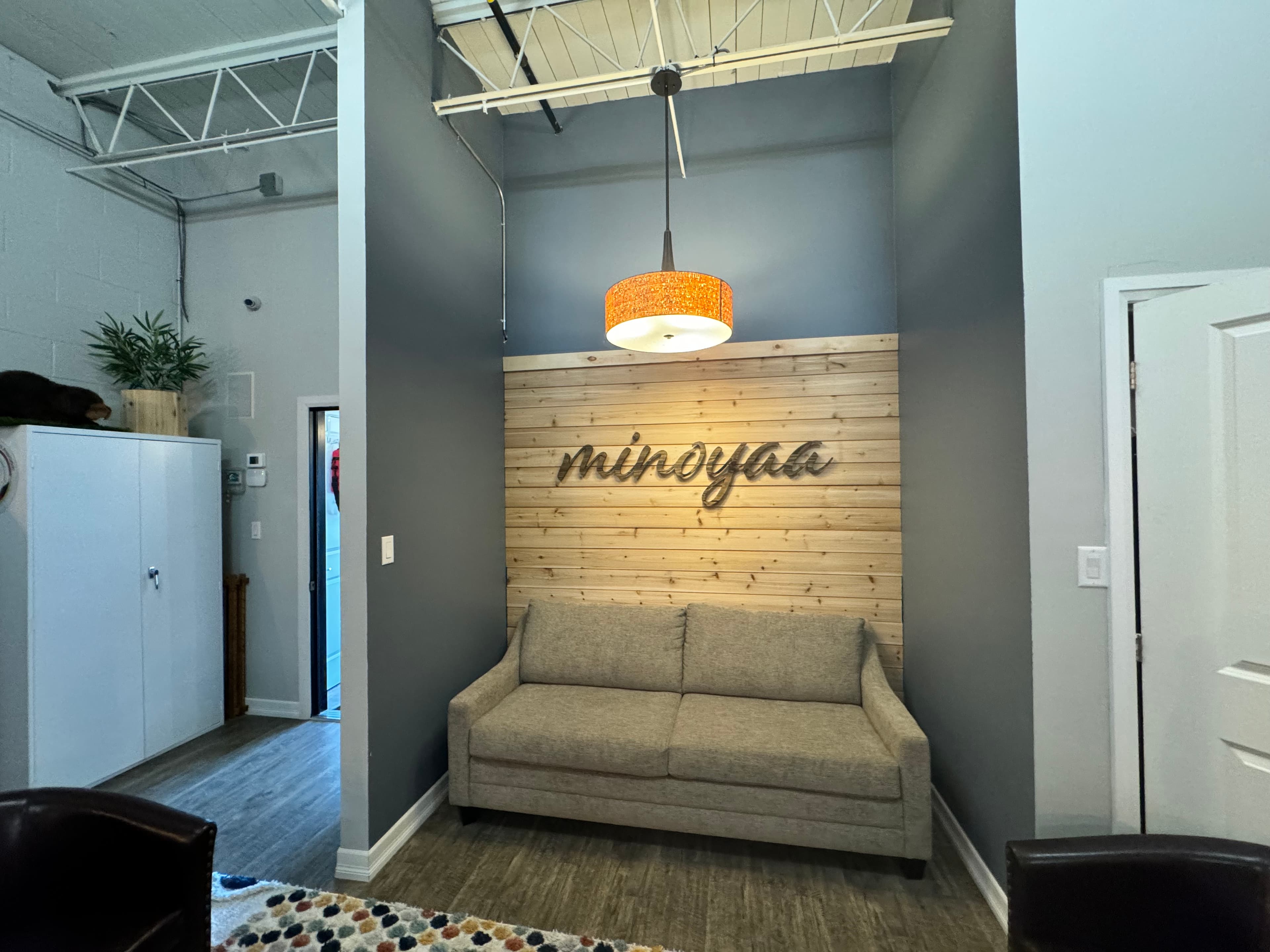
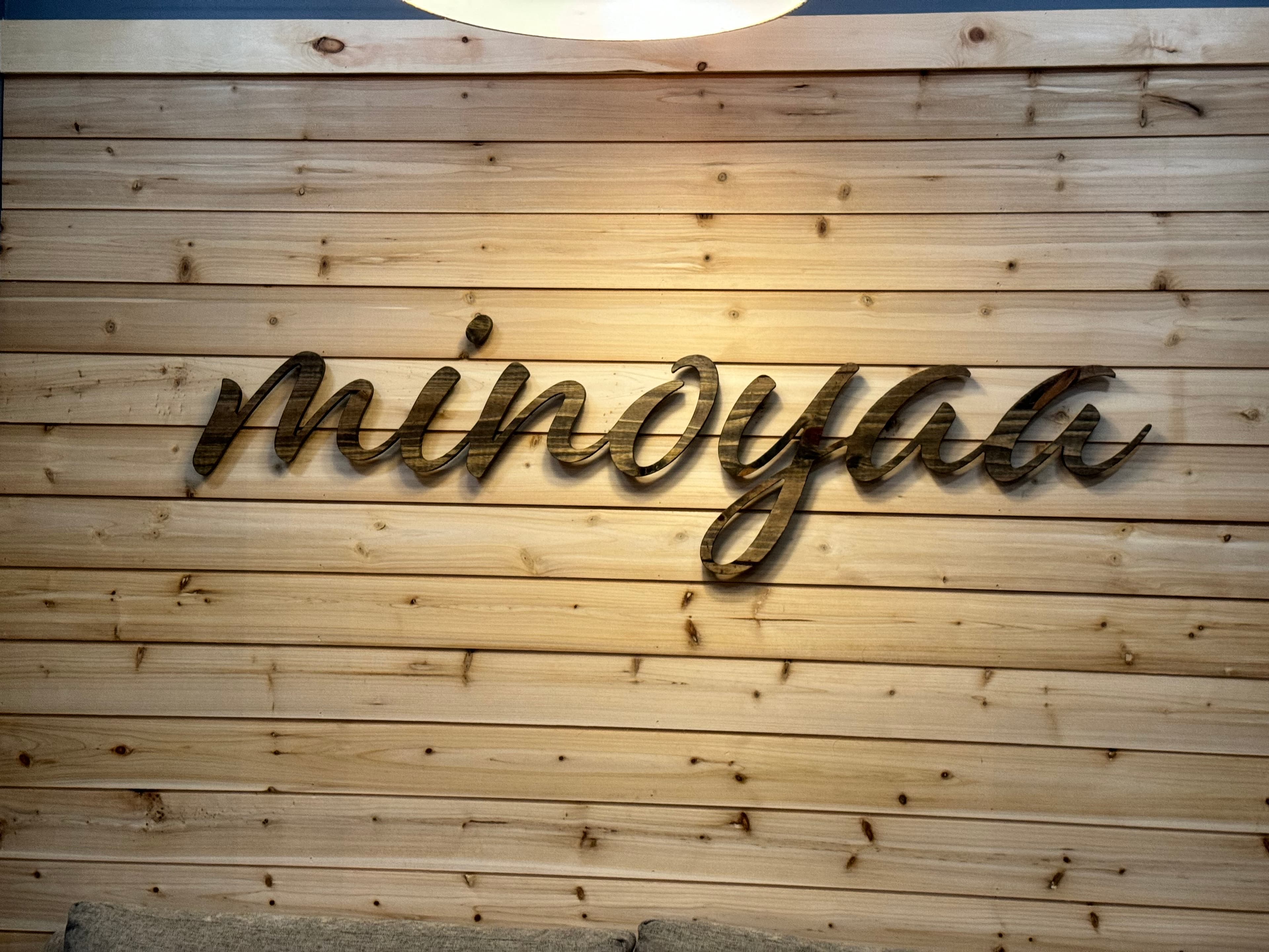
Minoyaa — “Be well, heal” — in the sitting area, a quiet space for conversation and rest.
There’s something about seeing these words in wood, standing off the wall with intention, that hits differently than a printed poster ever could. They become part of the architecture. Part of the feeling of the room.
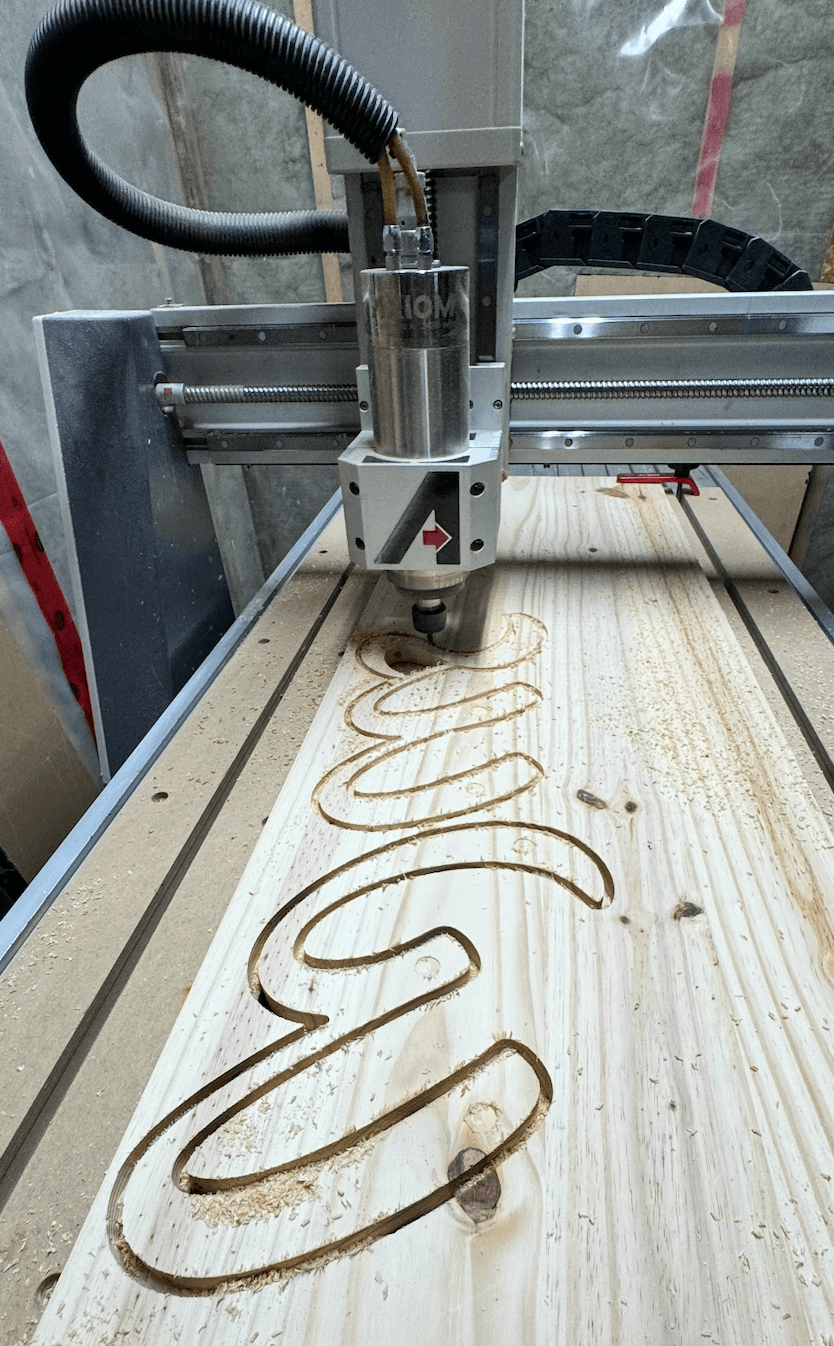
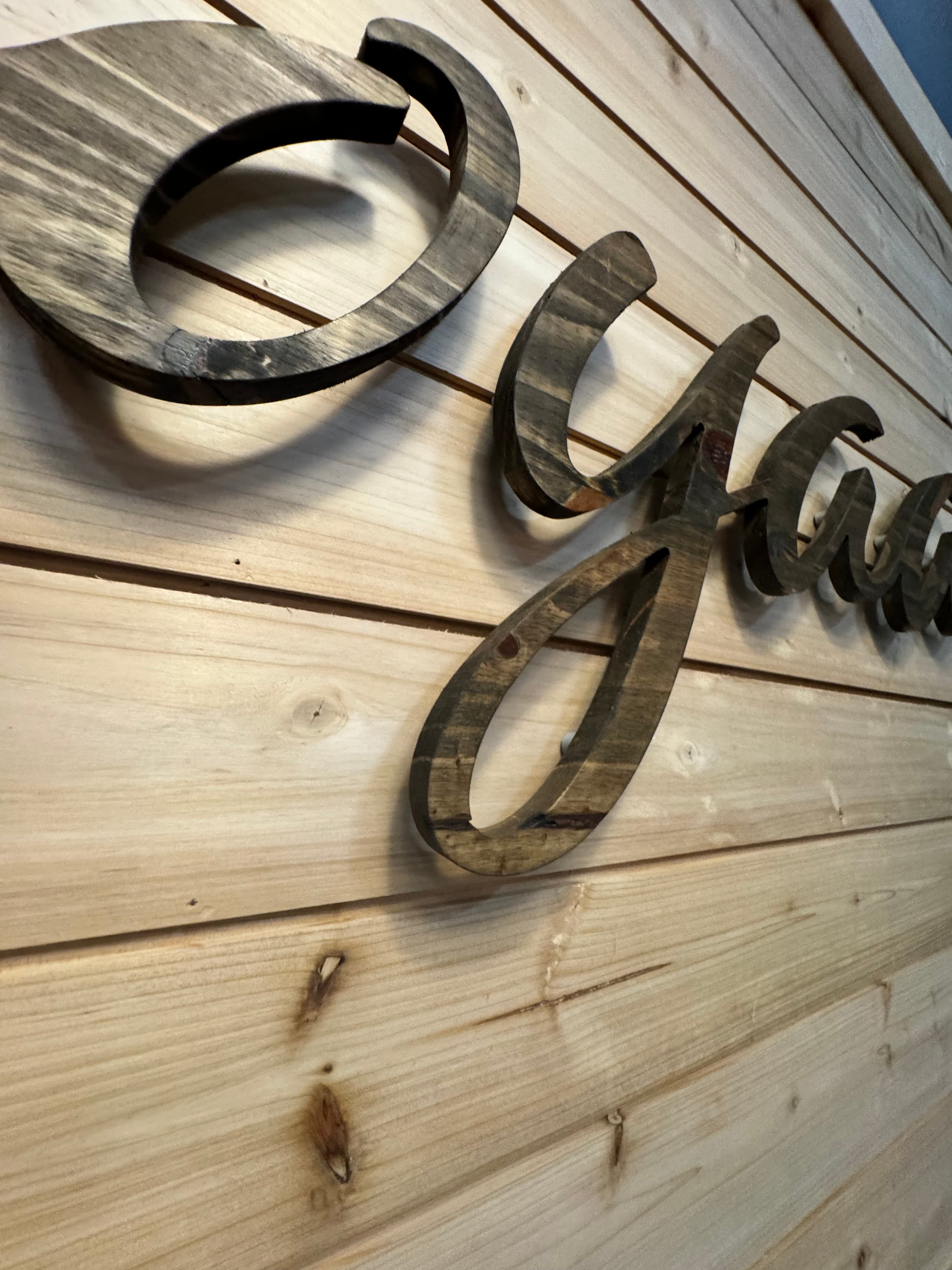
Cutting the Letters
Every letter was cut on our CNC from solid wood. Script lettering is one of the more demanding things you can ask a CNC to do — tight curves, thin strokes, and connected letterforms that need to hold together structurally while still looking fluid and natural.
Once cut, each letter was sanded, stained, and prepped for mounting. The wood grain showing through the stain gives them a warmth that you just can’t get from acrylic or metal — which felt right for this project.
The Standoff System
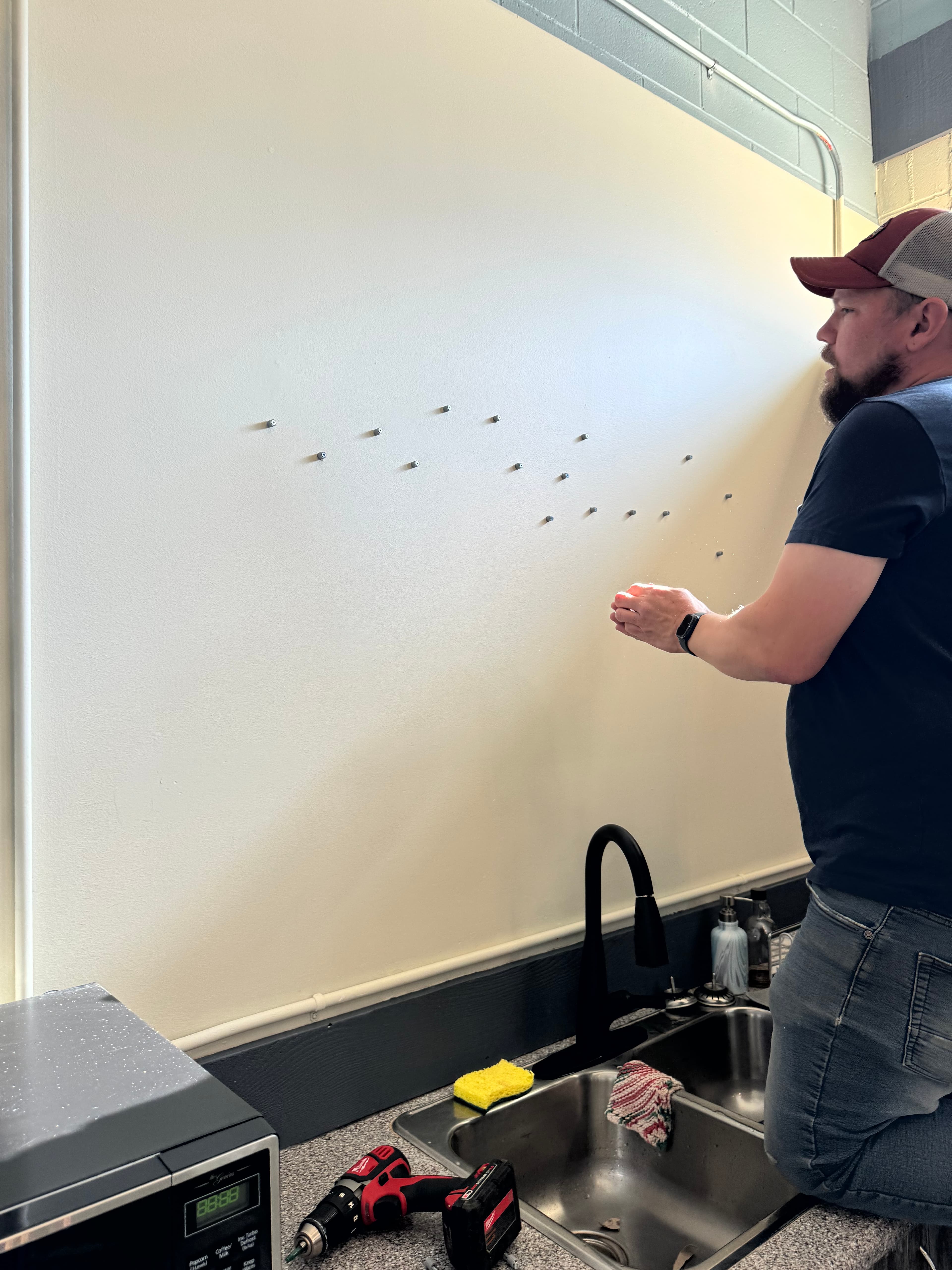
Here’s where it got interesting. Off-the-shelf standoff hardware exists, but it’s designed for flat acrylic panels — not individual script letters with curves and thin strokes. We needed something custom.
So we designed and 3D-printed our own standoff pegs. Small enough to hide behind the letters, strong enough to hold them off the wall at a consistent depth, and threaded so installation would be straightforward — drill, insert, mount.
But the real challenge wasn’t the pegs themselves. It was figuring out how to get the drill holes in the wall to line up perfectly with the pegs in the back of each letter. Script lettering doesn’t follow a grid. Every letter sits at a different angle, at a different height. One misaligned hole and the whole word looks off.
We used our plotter with a pen tool to draw a full-scale template directly onto paper — the exact outline of every letter with peg positions marked. Tape the template to the wall, drill through the marks, peel it off, and every standoff drops right into place.
That system — custom pegs plus plotter template — is something we built from scratch for this project. And now that we have it dialed in, we can repeat it for any word, any font, any wall. What took the most problem-solving the first time around is now a reliable, repeatable process.
The Finished Space
Seeing all three signs installed — the warm overhead lighting casting shadows behind each letter, the wood grain catching the light — that’s the moment where the engineering disappears and the feeling takes over. You stop seeing pegs and templates and CNC toolpaths. You just see words that belong exactly where they are.
Three signs. Three greetings in Anishinaabemowin. CNC-cut wood, 3D-printed standoffs we designed ourselves, and a plotter trick that turned a headache into a system.
Got something in mind?
We do custom work — and we love a good challenge.
Company swag, personalized gifts, one-of-a-kind keepsakes — if it can be engraved, cut, or poured, we're probably into it. Send us your idea and we'll figure out the rest.